This week in our workshop we were introduced to the photography studio. This was exciting and a fun practical; especially as I have never had the opportunity or experience with high end equipment. Within this we were shown the different lights available and how they work and what they do. We were also told about areas of health and safety and a few lights were rather large and heavy.
We used a black background and pastel pink background. My favourite of the two was the pastel pink due to the images I took coming out more crisp and professional looking and the coloured background looking more warm and fun. Below are some samples of what I took:-
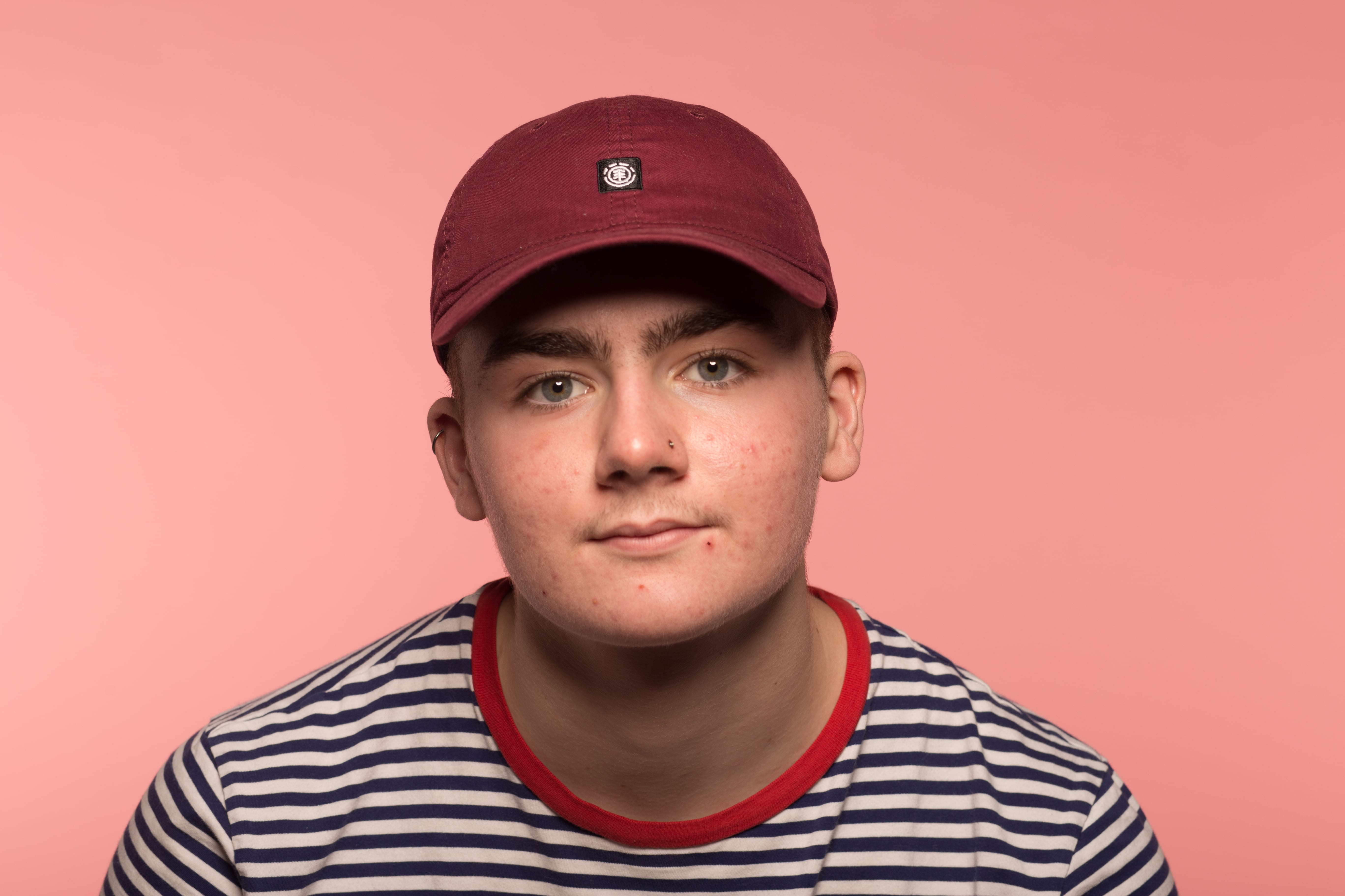
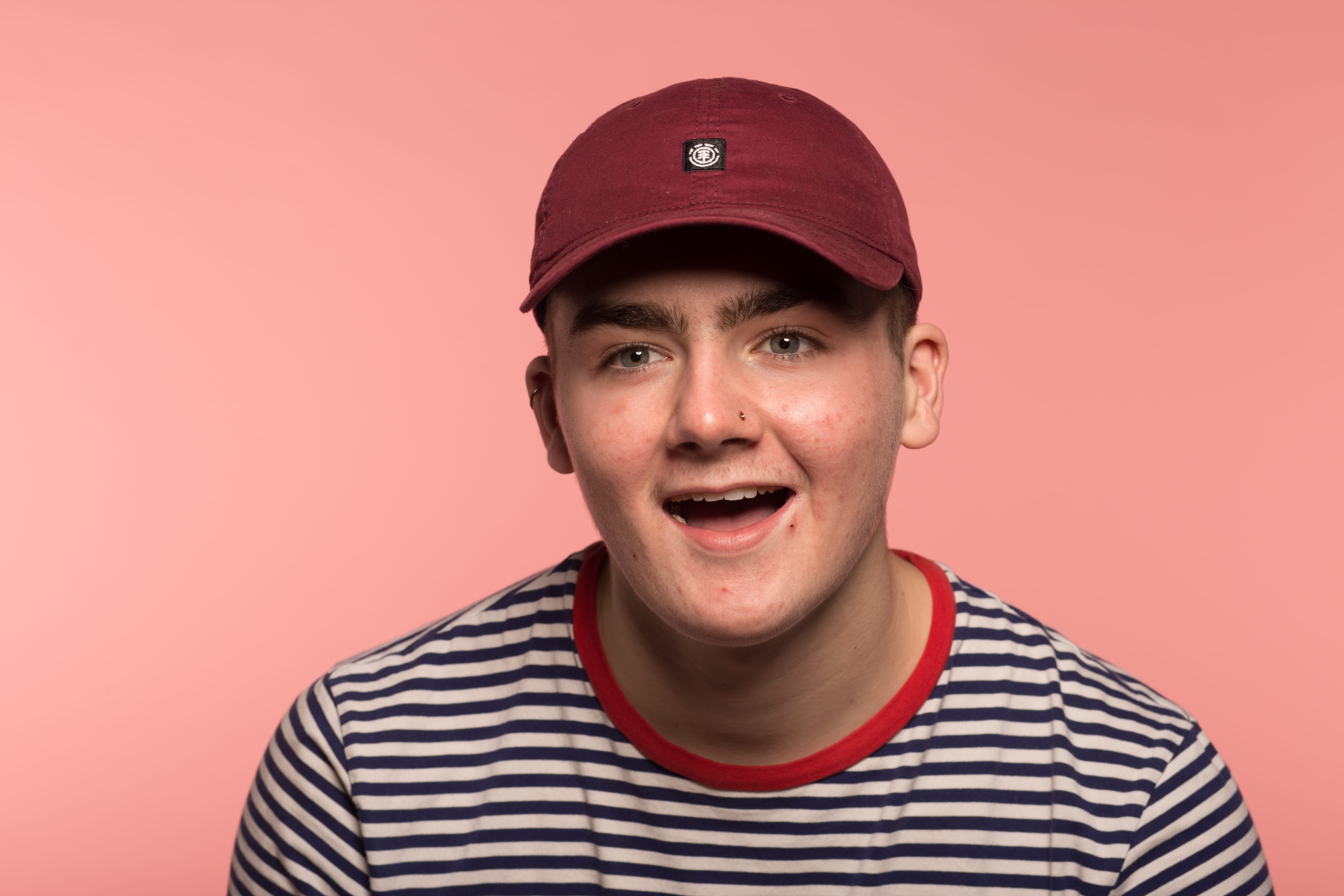
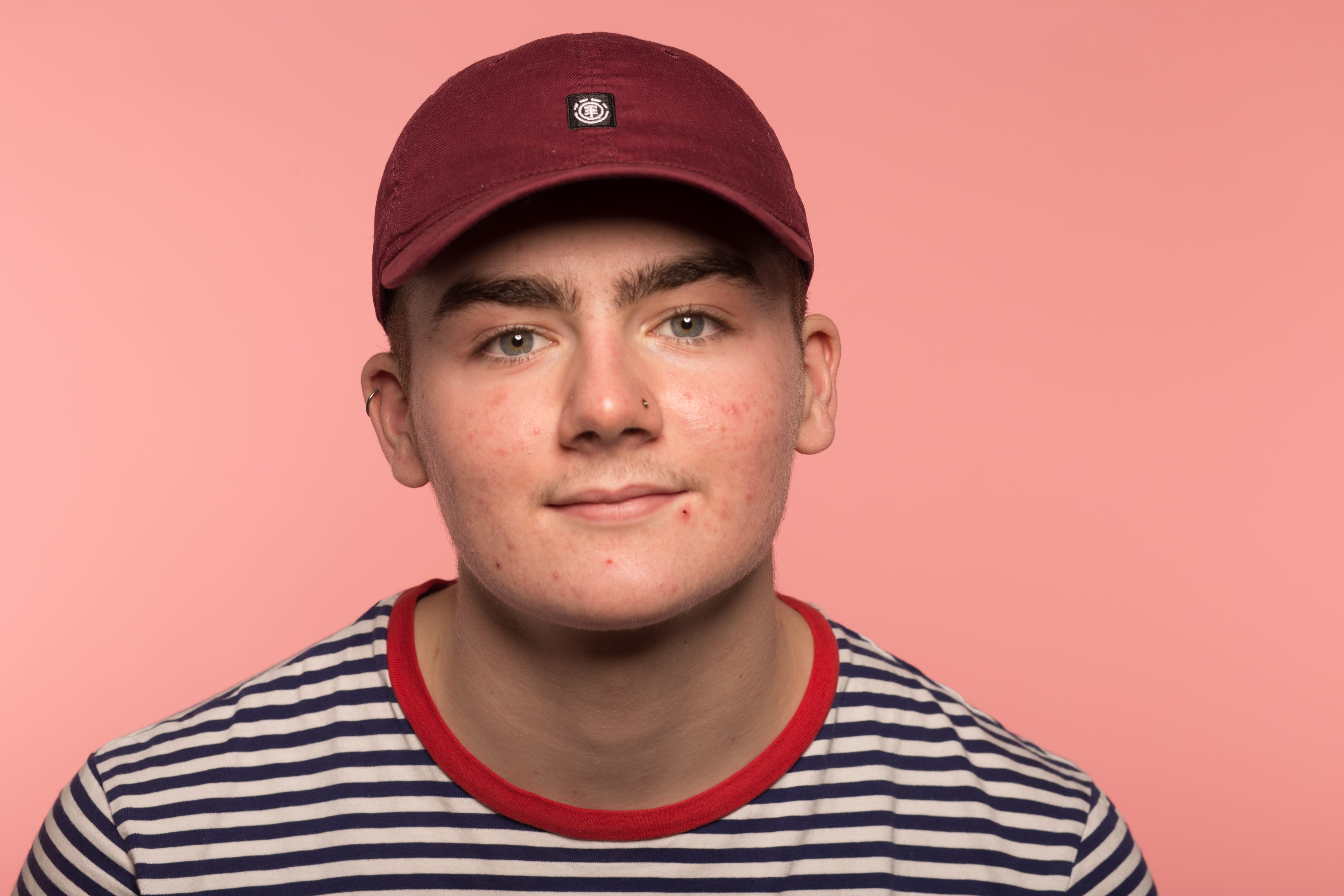
In my opinion, the coloured background gives a much cleaner and clearer look.
Below are the images I took on the black background:-
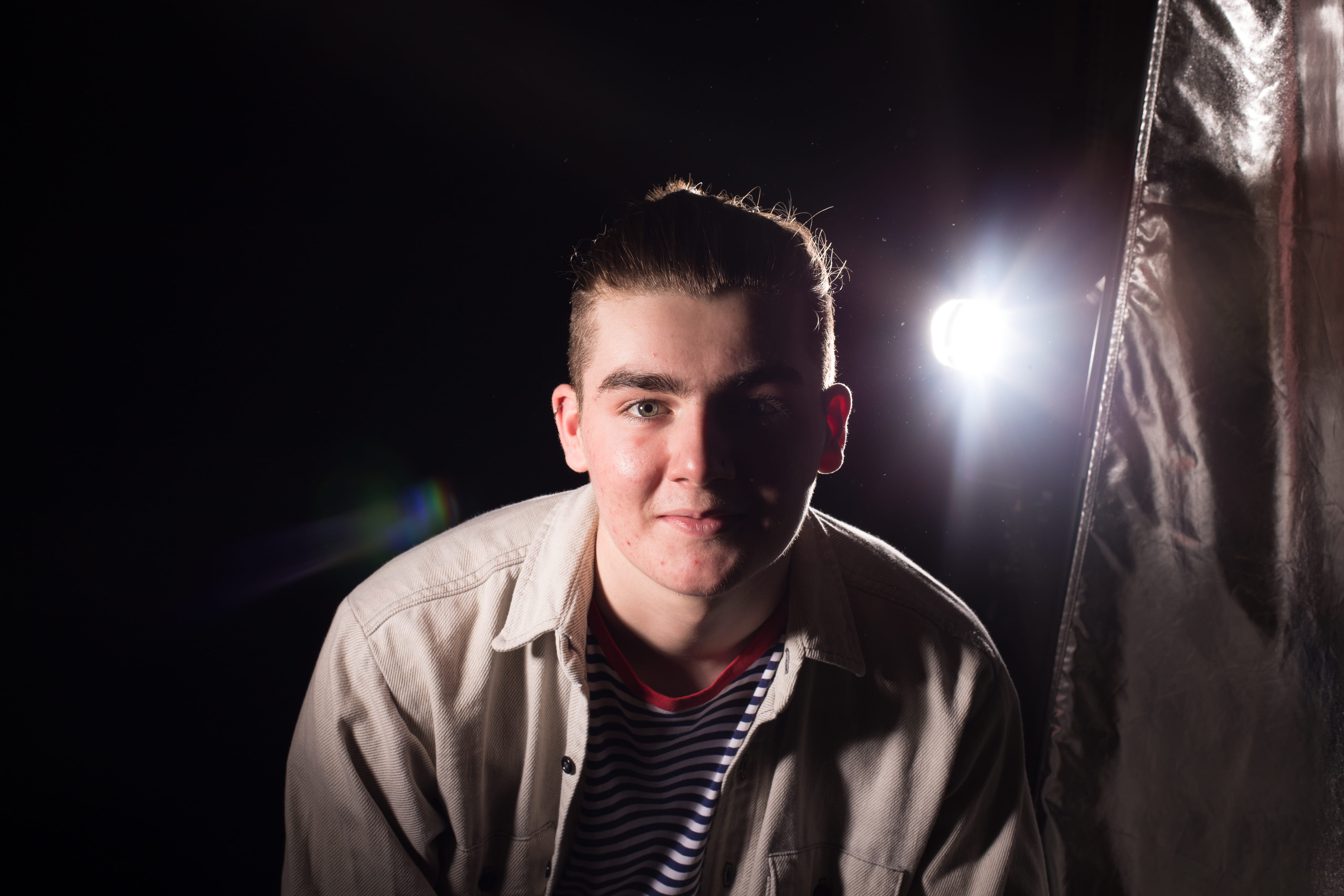
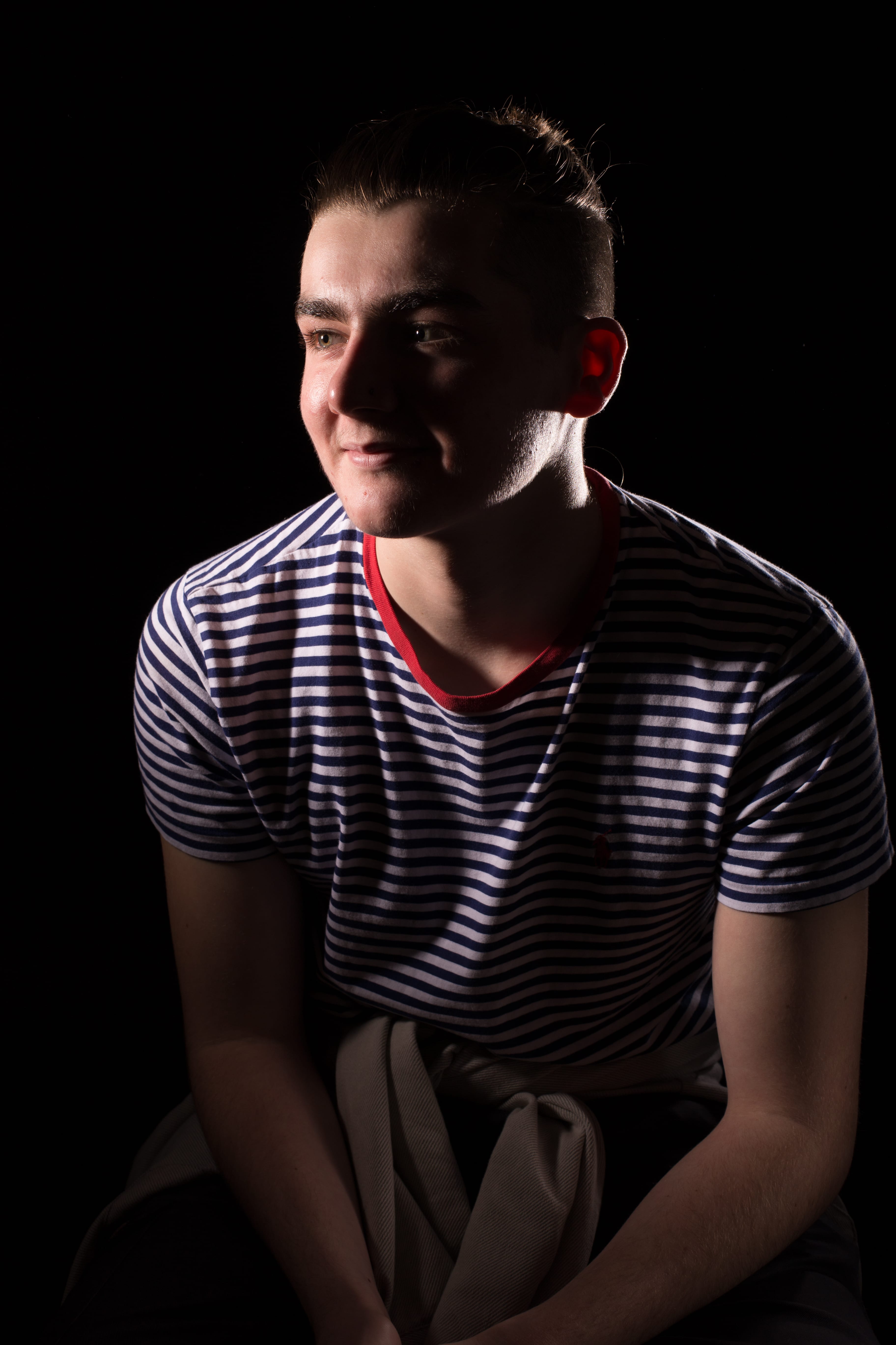
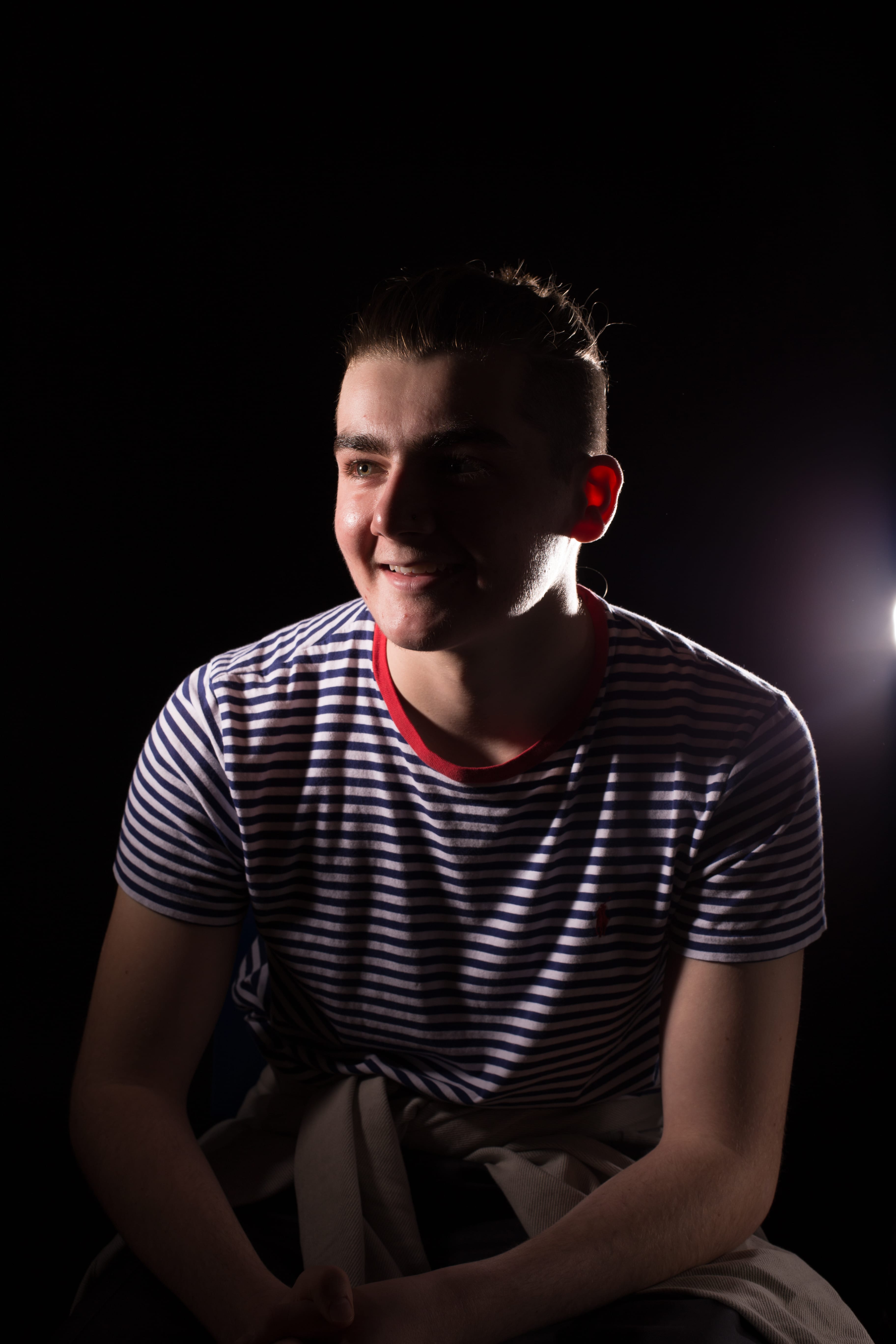
The black background created and cast some really nice shadowing and highlights on the subject. The altering of light intensity could have created much more unique images. I do feel the black background is for more experienced photographers or will need more experimentation and practice as it takes alot to frame it correctly whilst getting nice lighting and tones. This style would be really good for darker and moodier projects. I really liked how the light rays were captured in the first and if I had more knowledge could create something better with it.
Leave a comment