Here are a few images that I felt did not quite meet my expectations or the criteria.
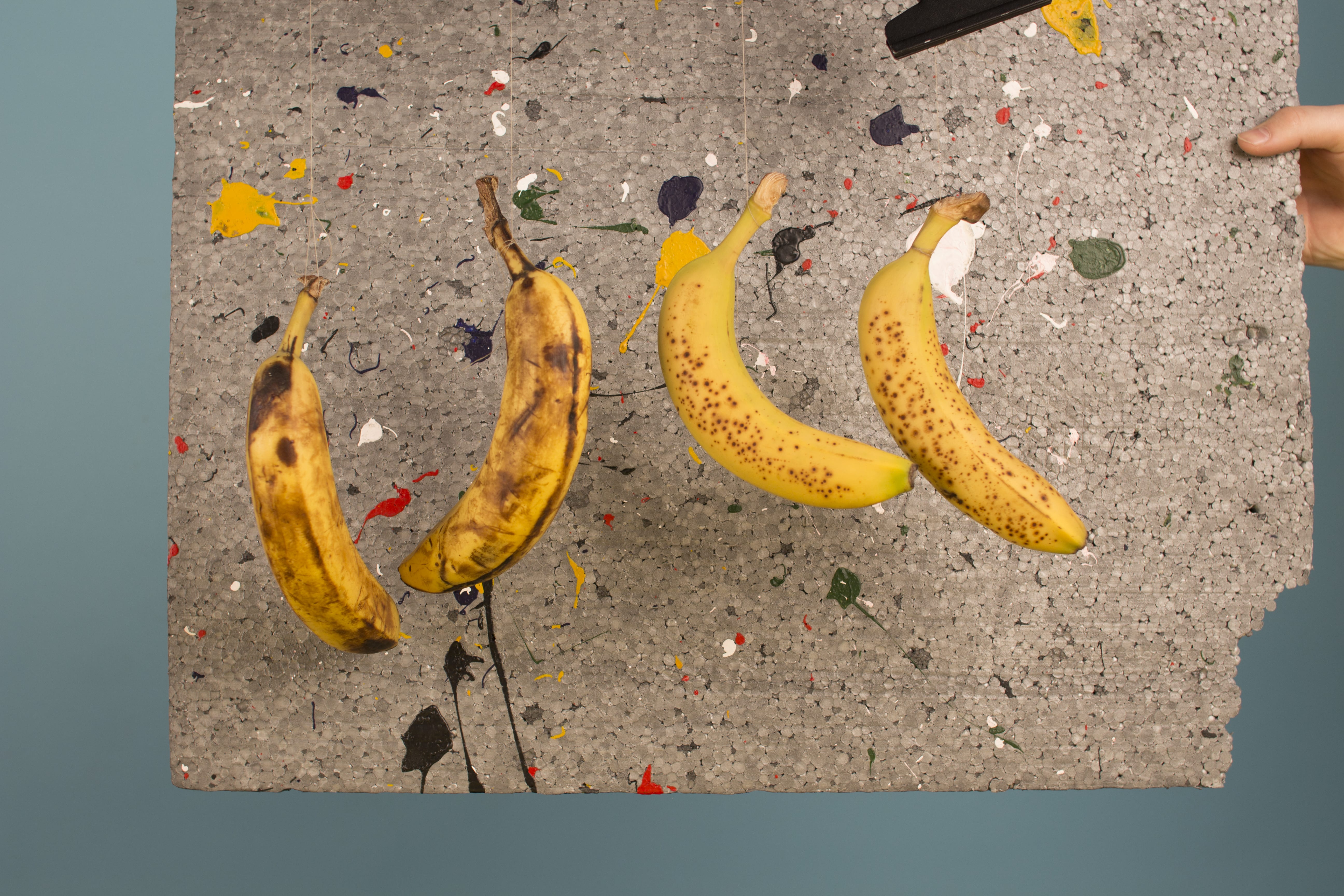
With this, I experimented with a different background that I had available. This was something that went against my research and inspiration but I wanted to take a creative risk. However, when reviewing it I felt it was far too ‘busy’ and in fact took away the conceptual detail within the objects and became distracting; hence why I remained with a plain background that had a nice colour contrast,
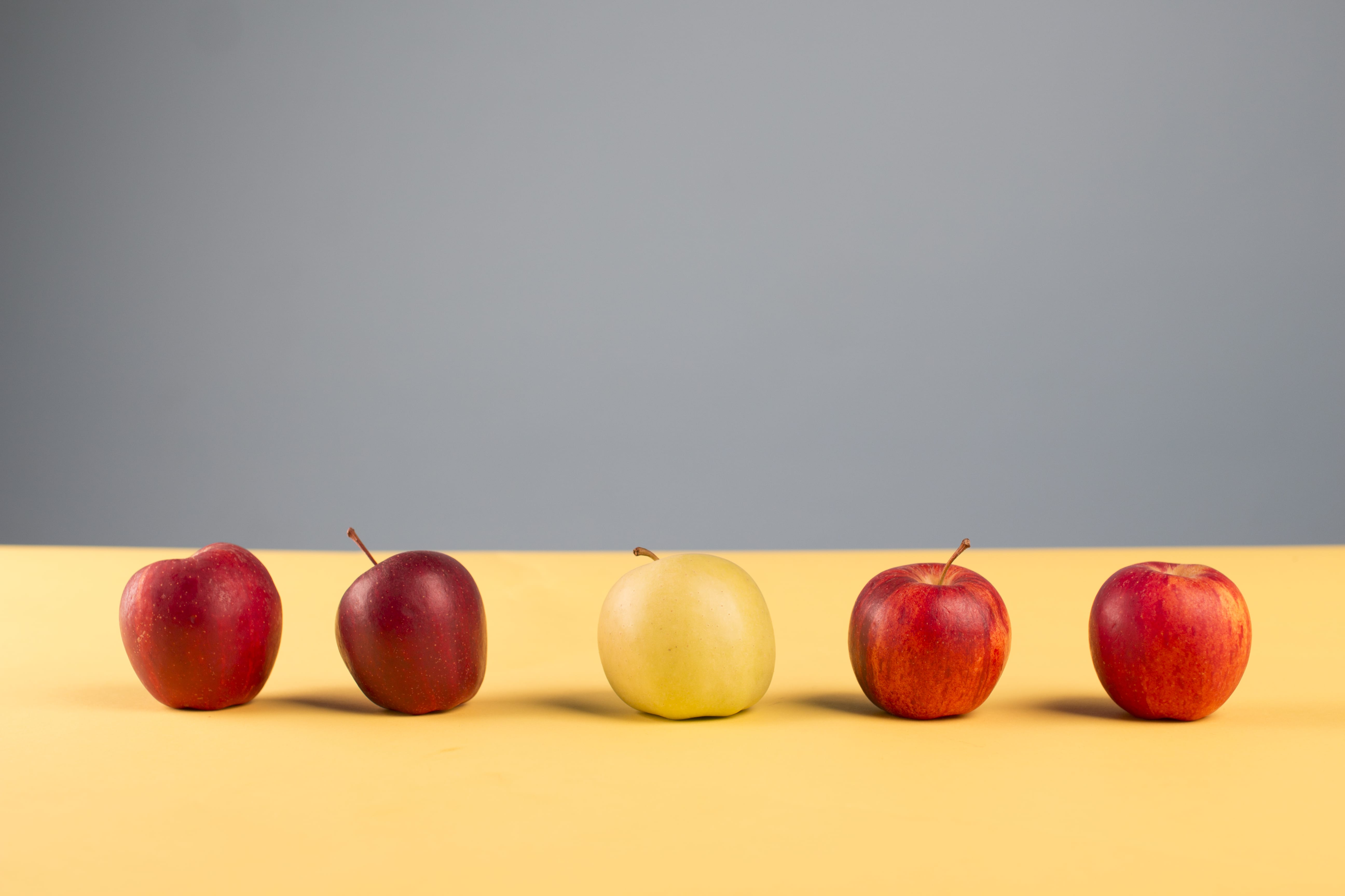
This is one example of how not altering the white balance can lead to images lacking their full potential. The colouring here is very mundane and exceedingly desaturated in comparison to my final images. Before receiving some advice and support a few of my images were coming out this colour but after switching the colour burst was amazing. These didn’t make the cut due to this technical issue and despite the colour being able to be edited in post, I felt it was best to capture it in the moment for a natural shot.
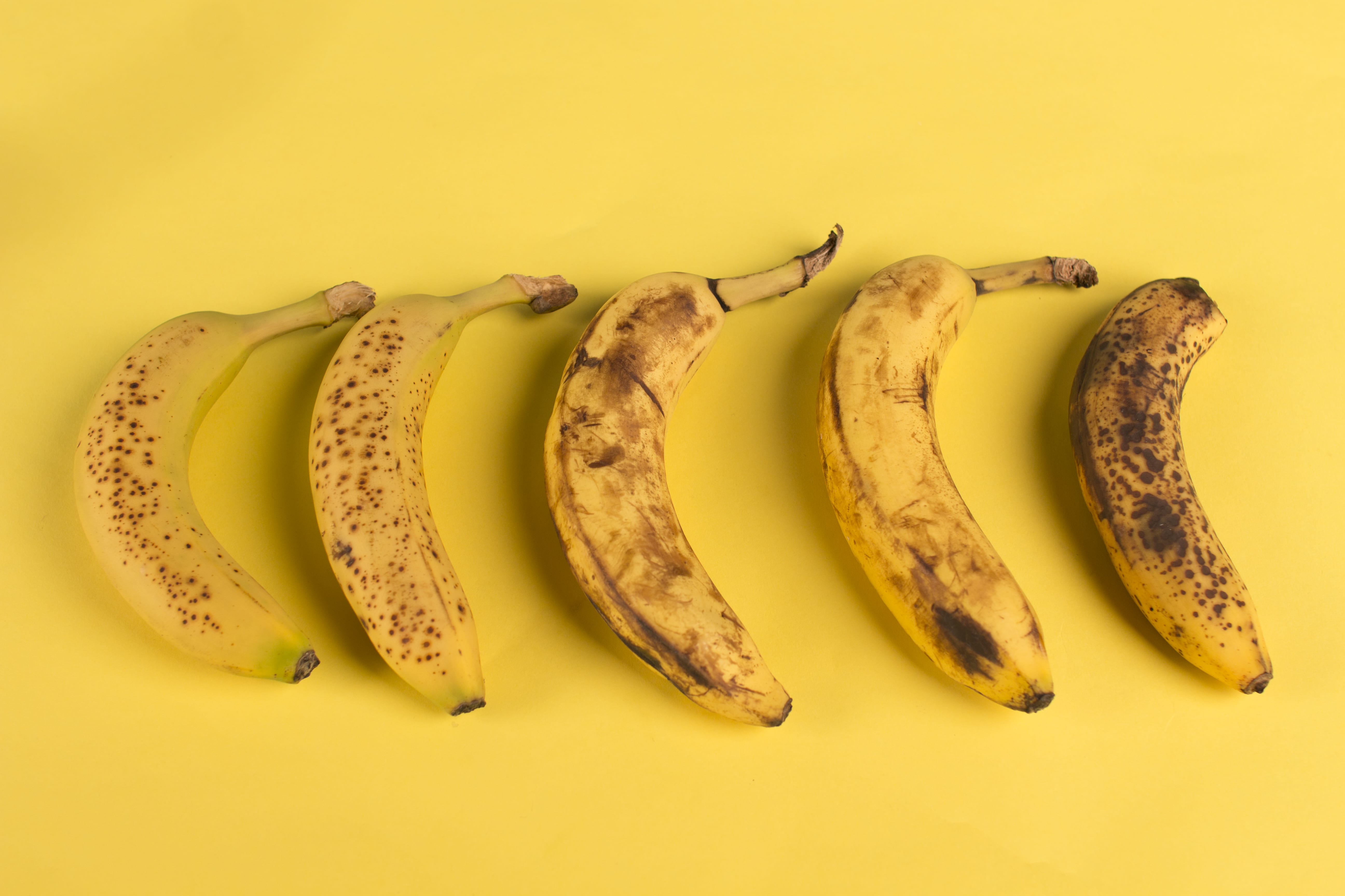
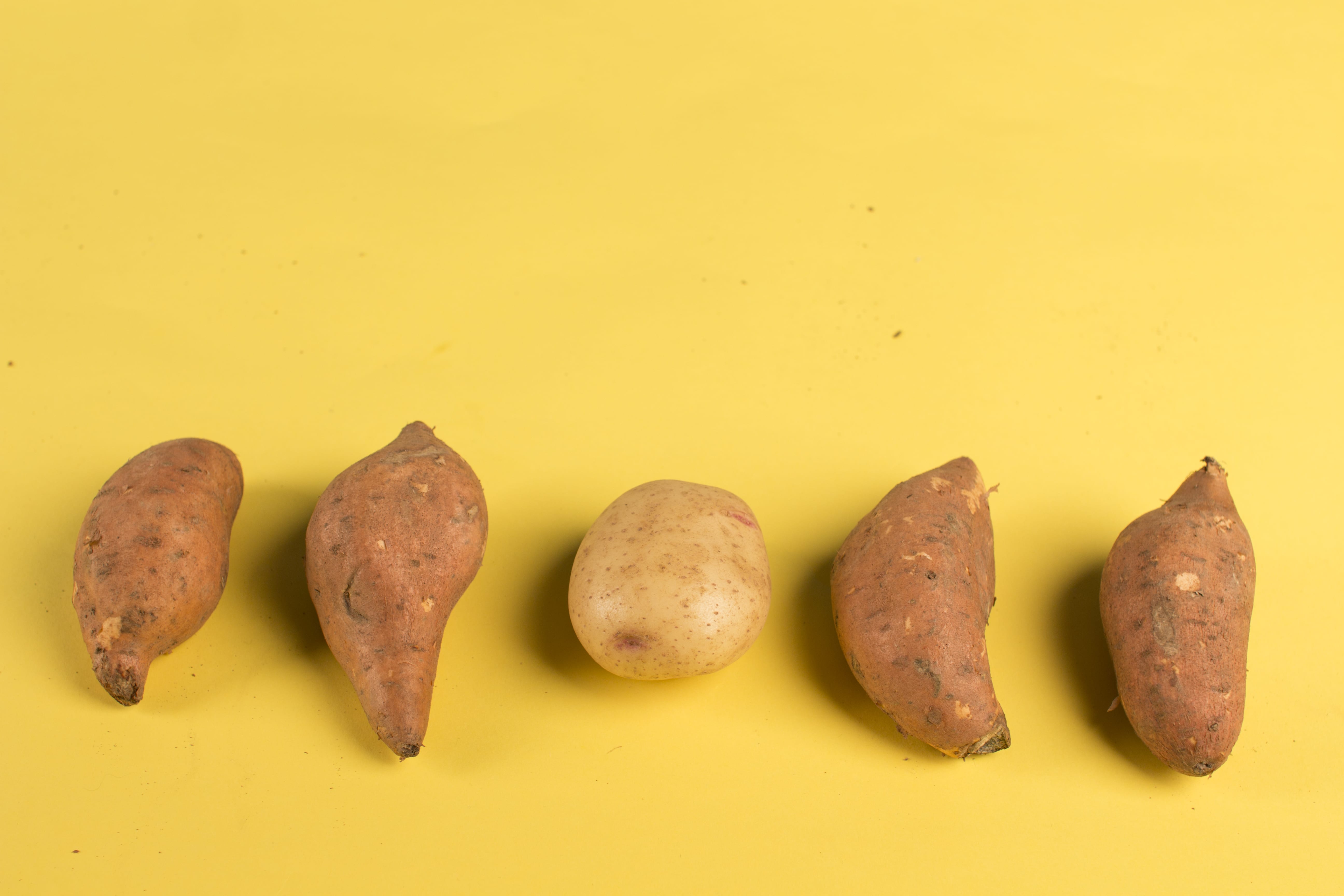
These didn’t make the cut due to their composition and layout. I experimented with different positions and styles but felt the straight line didn’t do the image justice and kept becoming repetitive in my pictures and after a while changed it completely; seen by the floating bananas and less potatoes. I wanted to make my shots interesting my using my space and environment whilst capturing the detail of each object, this was something not captured well in this composition.
Leave a comment