I chose to express migration through my images. The concept behind this is that the organic material represents people. My first thought was, ‘how can I represent this?’; I initially thought about what ‘migration’ means to me and what I think of. The first thing idea that comes to mind is difference, such as the different types of individuals (ethnicity etc…) and moving to different places. Even though they are different, the end goal is the same; they all want a place to call home and we are all human.
Concepts:-
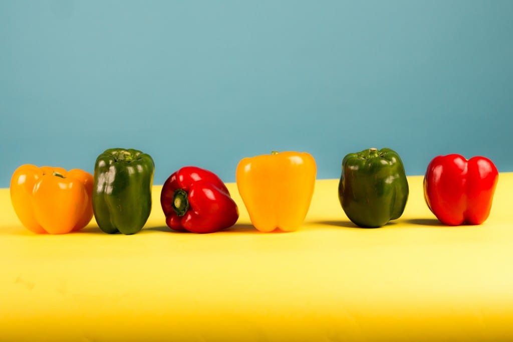
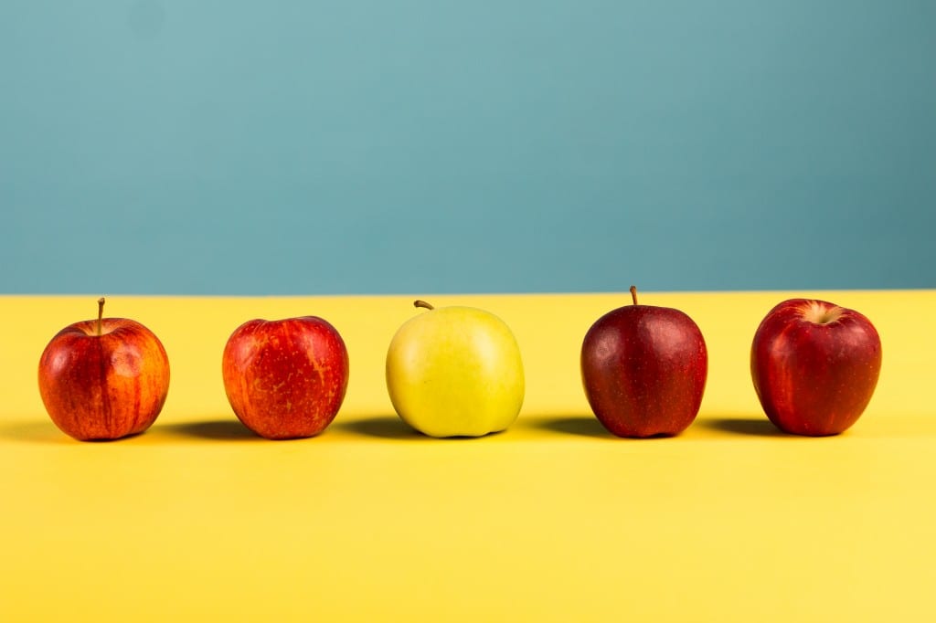
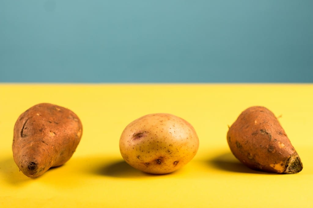
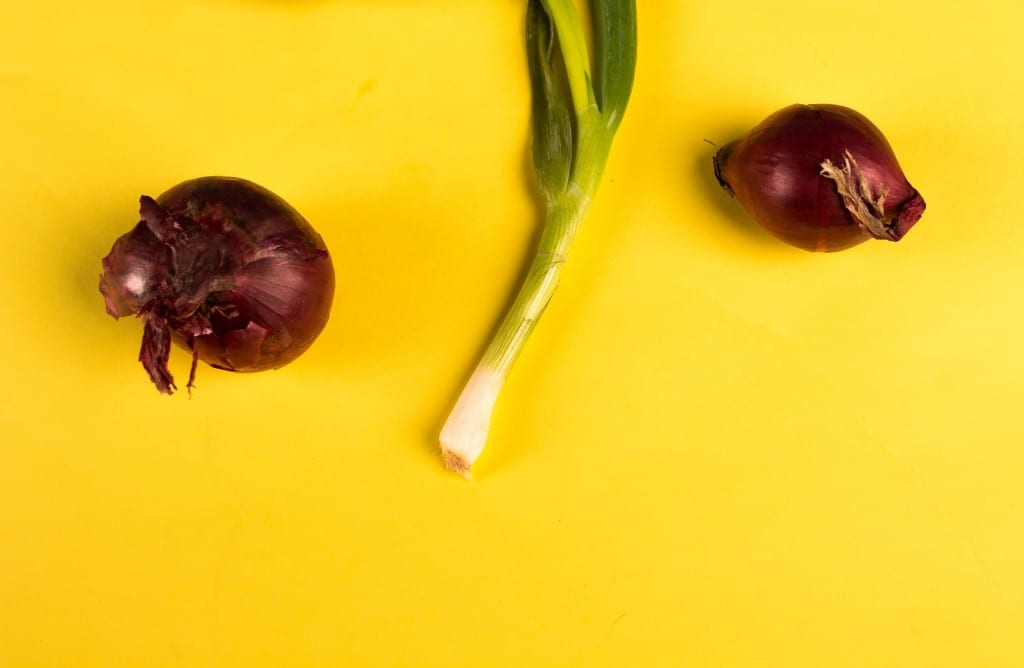
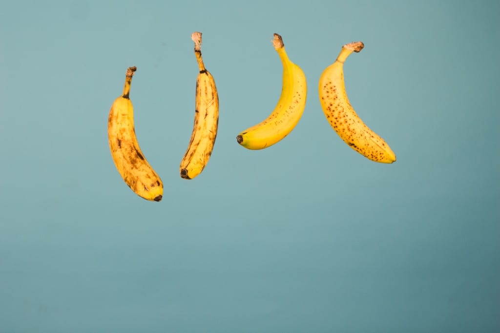
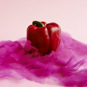
The idea of being different and the same in migration is shown in the food. The peppers and how they are different colours and shapes, much like our skin colours are different and our ethnicity leads to different appearances. Similarly, the apples are different colours and looks but still the same. The potatoes had a deeper concept in the way that the middle is a standard British crop whereas sweet potato has come from central America; showing how like humans the fruit has also travelled and moved. The idea of the onions is that both are different but are still from the same family, much like those who travel and migrate can be opposites of us but are still our ‘family’. Lastly, the bananas represent the idea once more of skin and looks, how some look freckled and others look scarred, each could connote ideas of struggle and change, much like those who migrate and move all have different stories and lives.
Research:-
To represent migration I considered the different aspects that could represent it. Much like Raymond Queneau said, ‘one must see everything’ (Perec, 2010) and this is the process I carried out. The main areas I thought that mattered the most in my concept were colour and style. This led me to researching similar artists and ideas behind each.
Firstly, I looked into colour and found books showing how colours complement one another and work together. This was vital for me as the objects I had picked were full of colour. Colours are said to be ‘the visual feelers which we relay our thoughts and information’ (Marvullo, 1989). I looked at the books ‘Color Vision’ (Marvullo, 1989) and ‘Color Design in Photography’ (Mante, 1972). Both mentioned colour wheels and how it was important to study these to find complimenting styles and colours within your work. For example, ‘Color Design’ discussed the idea of ‘contrast of hue’ where 3 colours can be used in full saturation to create the ‘simplest’ of contrasts and is said to be ‘appreciable even by the untrained eye’. This is something very evident in my work; seen in the first image where the peppers are very strong and differing colours but create an aesthetic look. ‘Color Vision’ discussed aspects of shadow which is something my objects would create and I could use to create more of a look. ‘Shadows can add depth and can be used to create three-dimensional feeling’ (Marvullo, 1989) to all images.
With type, I had to consider which objects to use that would represent my idea and concept whilst working well. I took this further by looking into existing food based still life. I found a book titled ‘Still Life’ (Penn, 2001) that had a variety of foods within such as ‘Wormy Apples’ (1995) and ‘Croissant’ (1982) that showed how they were composed to create an interesting final image. Additionally, I also found food based photography text called ‘Food and Drink Photographers’ (Gould, 2004) which showed individuals showcasing their work. This was key in my process as it showed different styles of presenting the food and how to create different moods. For instance, some were darkly lit and casted shadows while some were on a bright background and gave out lots of saturation. This led me to think about the atmosphere I wanted to project to my audience and how I could get the best images. Due to this, I decided to go saturated due to using fruit and vegetables which are full of colour and should be emphasised.
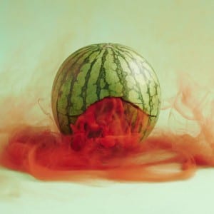
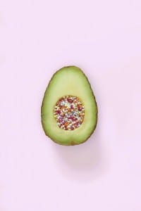
Research led me to finding photographers Maciek Jasik and Vanessa McKeown. Jasik created ‘Secret Lives’ (Jasik, undated) where we photographed fruit/vegetables and combined coloured smoke. This created beautiful images and suggested just how creative you can be with simple items. This benefited me as I saw how he used colour in his work to create further aesthetics. McKeown created ‘Good Gone Bad’ (McKeown, undated) where she photographed foods while making them look sweet. This inspired me in terms of the environment she shot in and the composition. She had close-ups of the foods which showed crisp detail and positioned them in a manner that fulfilled methods such as the rule of thirds and golden mean. Additionally, she used a single, coloured background which is something I aimed to use due to convenience and budget. McKeown’s use of the coloured background made a nice contrast against the object and other colours and did not allow for any distraction which is what I wanted so that my audience remain focused on the subject. In addition, artist Leta Sobierajski was recommended to me and upon research I found Sobierajski had created a piece called ‘Add/Ends’ (Sobierajski, undated). Within this piece she had also incorporated fruits and other foods tying in nicely with my design leading me to another style to review. She also juxtaposed and used colour incredibly and contrasted and used a variation of colours to compliment each other and create different moods. Something I wanted to fulfill and enhance in my project.
Overall, I am very happy with the result of my images. I feel they are clear and crisp with the deeper concept coming through. The part I am most pleased with is the colouring and contrast. I felt I picked the appropriate coloured backgrounds and subject colours. One issue I faced initially was that the colours came out dull, however when I changed the white balance the colours burst with saturation creating a stronger and bolder contrast amongst each item. If I was to change anything it would be to explore other types of foods and sizes to perhaps create different groupings and patterns to represent either migration or division. Additionally, I would try different angles and shot types even further to add difference and make it more interesting to look at for the viewer. Although, I do feel I attempted this but did want to keep a running theme.
References:-
Perec, Georges (2010), ‘An Attempt At Exhausting a Place in Paris’, P.50, Wakefield Press
Penn, Irving (2001), ‘Still Life’, Constrasto
Gould, Nicholas (2004), ‘Contact Food and Drink Photographers’, Elfande
Marvullo, Joe (1989), ‘Color Vision’, Amphoto
Mante, Harald (1972), ‘Color Design in Photography’, Rocky Nook
Maciek, Jasik (undated), ‘Secret Lives Photography’
McKeown, Vanessa (undated), ‘Good Gone Bad’
Sobierajski, Leta (undated) ‘Adds/Ends’,https://letasobierajski.com/
